

The Perfect Retail Store Layout: How to Map the Customer Journey Inside Your Store
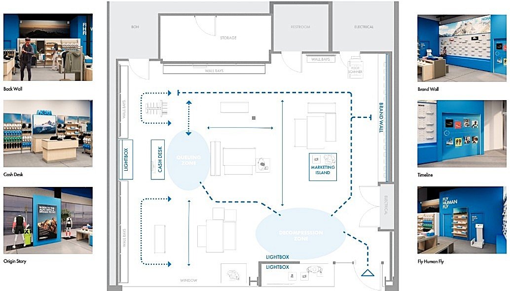
HOKA partnered with Feels on Brand for a major remodel that included a retail store layout that led the customer through the 7 phases of the customer journey.
Customer expectations of retailers have shifted due to the integration of e-commerce in their daily lives. People don’t walk into physical stores simply to purchase products anymore. They visit retailers for an experience, and in this saturated market, if that experience falls flat, they’ll go somewhere else. When brands neglect to create strategic layouts that guide the customer’s journey once inside their stores, they are losing sales and brand loyalty.
In this article, we’re breaking down how to create a smooth customer journey inside a physical space and how to design a retail store layout that actually guides customer behavior, from the moment someone sees your storefront to the moment they walk out, so you can deliver the kind of experience your customers expect.
What Is an In-Store Customer Journey?
A customer journey is the series of interactions someone has with your brand. Online, that journey is made up of clicks, views, pages, and conversions, but in retail, it’s something entirely different, because the way people behave inside physical spaces is unique. Customers don’t move through a store at random. They follow cues from what they can see, what draws their attention, and how the space guides them. When designed well, your store layout uses those cues to influence how customers move, what they notice, and the order in which they experience your products. That might mean you need to intentionally guide customers deeper into the space before introducing key items or positioning fitting rooms in a way that encourages full exploration before decision-making. Because customers can move freely around the space, the goal is less about controlling the journey and more about intentionally guiding it.
Why Store Layouts are a Business Strategy (Not Just Design)
Most retailers view store layout through the lens of aesthetics. If the space looks good and products can be displayed effectively, then the job feels complete. But a strategic retail layout is far more than an aesthetic decision; it’s a business strategy.
If your store isn’t intentionally guiding customer behavior, people may miss entire sections, overlook key products, or leave without purchasing simply because the space feels overwhelming or confusing. A well-designed retail space, on the other hand, moves people intentionally by creating clarity, building curiosity, and removing friction at the exact moments it matters most. Instead of simply browsing, customers begin engaging with products, exploring the space naturally, and moving through the store in a way that supports purchasing decisions. When retailers treat store layout as part of their business strategy, they create stronger customer experiences, better sales performance, and ultimately more loyal customers.
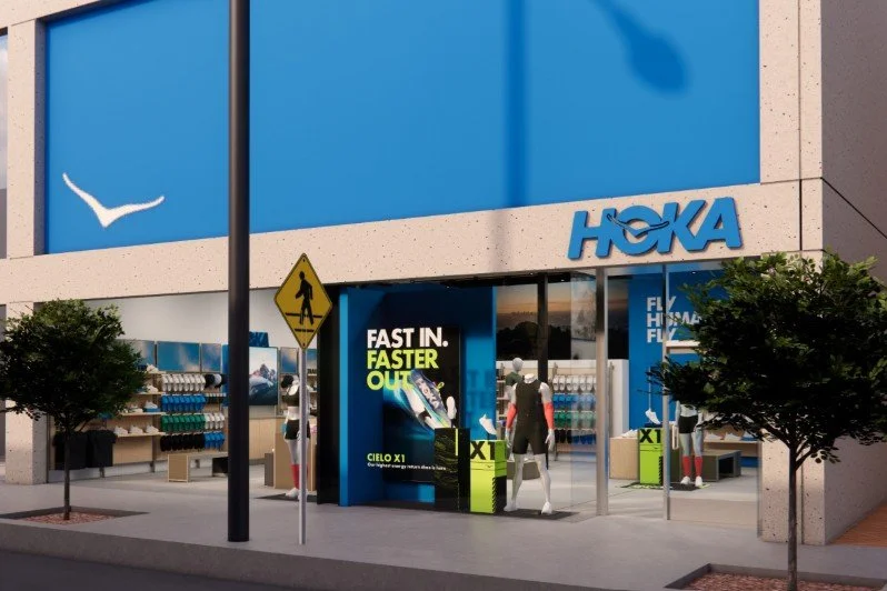
Feels on Brand designed the windows to create a portal into the store. The facade is enhanced with a new wall that creates a blue window portal, framing the entry into the store, adding depth to the shopfront, and creating a designated zone for marketing stories.
The 7 Phases of a High-Performing Retail Journey
Phase 1: Invite Customers Inside
The first step in any customer journey is to gain the customer's attention and then invite them inside. This means the customer journey begins before someone ever sets foot inside your store. Your storefront is the first opportunity to communicate your brand values, the type of experience customers can expect, and whether the space feels worth entering. Strong exterior branding, engaging window displays, and intentional visual contrast all work together to capture attention and create curiosity among passersby.
Once a customer steps inside, the experience should ease them into the space rather than immediately overwhelming them with product. Welcome moments give customers time to familiarize themselves with the brand, understand the atmosphere, and settle into the environment. More importantly, they communicate that customers are being invited to explore, not simply make a purchase and leave. Welcome moments can be created in numerous ways, including visual elements, sensory details, or simply an associate welcoming them in.
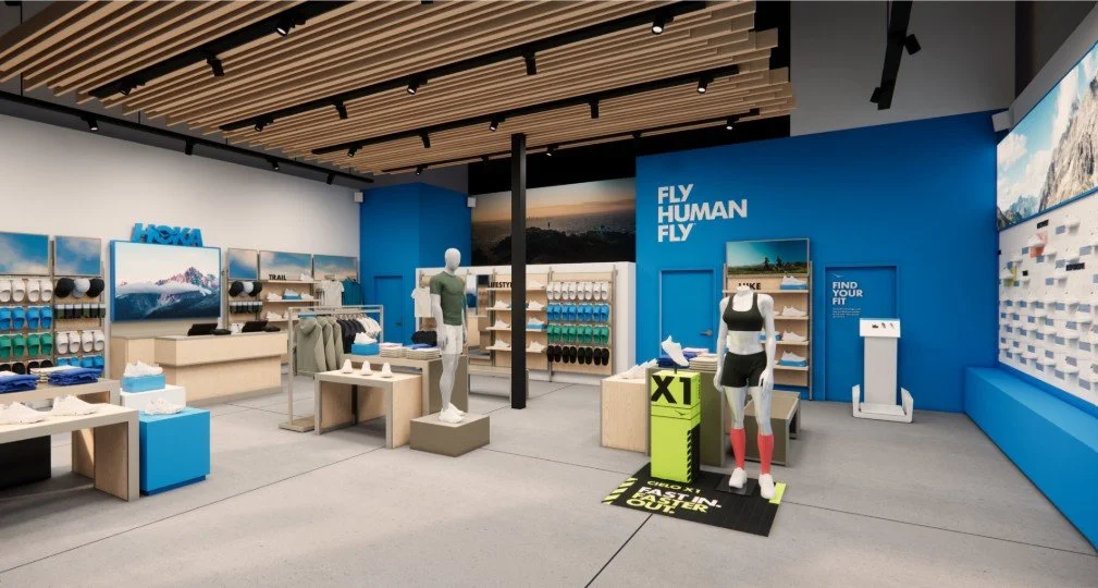
We designed an entry that invites customers inside, helps them orient, and encourages discovery by creating multiple pathways that invite the customer into the store.
Phase 2: Orient the customer
Right after the welcome moment, customers begin looking for cues that help them understand the space. Within just a few seconds, they are subconsciously asking themselves where they should go, what the store offers, and how the space is organized. If those answers are not clear, customers can quickly become overwhelmed or disengaged.
Strong retail store layouts use sightlines, spatial organization, and wayfinding to create clarity from the moment customers walk in. Clear pathways and defined product zones help customers navigate the space naturally, while signage and visual cues reinforce where different categories or experiences are located. When customers can quickly understand the layout, they feel more confident exploring further.
Many retailers also use a central anchor moment to draw customers deeper into the store. This could be a product display, a branded installation, or a focal point that visually guides movement throughout the space. Rather than leaving customers to figure out the layout on their own, intentional orientation creates a smoother experience that encourages exploration instead of hesitation.
Phase 3: Encourage Discovery
Once customers have been oriented, the next step is encouraging them to explore and engage with the space. This is where thoughtful retail store layout design shifts from simple navigation to meaningful discovery.
Intentional pathways include layered product storytelling, feature displays, and well-placed pause moments, which all work together to guide customers naturally through the store while exposing them to key products, categories, and brand experiences along the way. Changes in texture, lighting, display scale, or focal points can subtly direct attention and movement without making the experience feel forced.
When discovery is encouraged through design, customers spend more time in the space, interact with more products, and develop a stronger connection to the brand. Instead of shopping for a single item, they begin exploring the store with curiosity.

In each location we add localized elements throughout each store to connect with the community. In HOKA Chicago we added this localized welcome moment as well as other aspects throughout the store.
Phase 4: Build Connection Through Community
While in the discovery phase, introduce a sense of belonging by building a community connection. Whether it's a display about hosting events, highlighting a brand's mission, showcasing customer stories, or creating spaces where people can gather, community-building transforms a transaction into a relationship.
When customers feel connected to a brand and the people behind it, they're more likely to stay longer, engage more deeply, and return in the future. Retail spaces that successfully foster community become destinations rather than just stores that build loyalty extending far beyond a single purchase.
Phase 5: Support Decision-Making
After customers begin engaging with products, the retail environment should support decision-making and interaction. This is where store layout becomes especially important because customers are no longer simply browsing, but evaluating products, comparing options, and imagining how items fit into their lives.
Intuitive try-on and testing areas help create confidence during this stage of the customer journey. Whether someone is trying on apparel, testing gear, or interacting with products firsthand, the experience should feel comfortable and supported rather than inconvenient or rushed.
Products and experiences should naturally connect by being positioned together to create a smoother shopping experience. Place seating near footwear displays, fitting rooms near items that require changing, and mirrors near sunglass displays to allow customers to interact with products more naturally and comfortably.
Clear product information, such as POP displays, and thoughtful merchandising also help customers make decisions more easily without feeling overwhelmed. When customers are met with well-designed retail spaces, they feel supported throughout the decision-making process rather than confused or pressured into making a purchase.

The Cash Desk is on a prominent wall visible from the entry, with a lightbox and dimensional logo behind it. The lightbox behind the cash desk tells an origin story by Atmospheric cloud graphics above fixturing connect back to the “FLY HUMAN FLY” campaign.
Phase 6: Convert the sale
Once a customer is ready to purchase, the checkout experience should feel seamless and intuitive. Even after a strong in-store experience, unnecessary friction at checkout can negatively impact the final stage of the customer journey.
Customers should be able to quickly identify where checkout is located and move toward it naturally without confusion. A visible and accessible checkout area helps maintain flow throughout the store while reducing hesitation during purchase decisions. At the same time, checkout should feel integrated into the retail environment rather than disconnected from the rest of the experience.
Strategic product placements can also help this area serve multiple purposes. In many retail spaces, the checkout counter acts as both the final place to convert the sale and an additional place to sell accessories as add-on purchases. When designed strategically, it can support customer service, reinforce branding, and encourage additional purchases through carefully placed accessories or add-on items.
A strong checkout experience helps the customer leave the store feeling that the entire experience was smooth, intentional, and easy to navigate.

As users leave, they have one last chance to learn more about the brand to reiterate that they should be happy with their purchase.
Phase 7: Say Goodbye / Thank you
The customer journey does not end once the purchase is complete. The final moments inside a retail space often shape the lasting impression customers leave with, making this stage just as important as the first interaction.
An easy and intuitive pathway out of the store helps maintain a sense of comfort and flow through the end of the experience. Along the way, retailers have one final opportunity to reinforce their brand and strengthen long-term customer relationships through loyalty programs, event invitations, or subtle prompts that encourage customers to stay connected.
When approached thoughtfully, these moments feel like a natural extension of the retail experience rather than a sales tactic. A strong retail experience leaves customers with a positive impression of the brand itself, increasing the likelihood that they return in the future.
The Biggest Mistake Retailers Make When Creating Their Retail Store Layout
Not Clearly Communicating Your Brand Values
Customers today have a plethora of options when it comes to purchasing products. This means that they have the choice (and desire) to purchase products from brands that align with their values and lifestyles. Yet many retailers miss the opportunity to communicate what their brand stands for within the physical store experience. Whether it's sustainability initiatives, craftsmanship, community involvement, or a unique company mission, these stories should be woven throughout the retail environment. When customers understand the "why" behind a brand, they have a deeper reason to connect with it and ultimately make a purchase.
Filling the Store with Too Much Product
One of the most common mistakes we see retailers make is believing that more product equals more sales. In reality, overcrowded stores can create decision fatigue and make it difficult for customers to focus. Effective retail environments balance product displays with storytelling moments, lifestyle imagery, and visual breathing room. Giving products space to stand out helps customers better understand their value while creating a more enjoyable shopping experience.

In this one image, you can see Cotopaxi leaves room for customers to orient themselves, communicates their brand values, and gives the customer the room they need to explore.
Placing Product Too Close to the Entrance
The first few feet inside a store are some of the most important. When products are positioned immediately at the entrance, customers often walk right past them because they're still orienting themselves to the environment. This area, often referred to as the decompression zone, gives shoppers a chance to take in their surroundings, understand where they are, and begin engaging with the space. Retailers who use this area strategically as a welcome moment can create a stronger first impression and guide customers deeper into the store.
Not Creating Space for Customers to Stay
The longer customers remain in a store, the more opportunities there are for engagement and discovery. However, many retail environments are designed entirely around transactions rather than experiences. Incorporating seating areas, gathering spaces, fitting room lounges, or other comfortable touchpoints encourages customers to slow down and spend more time interacting with the brand. These moments can transform a quick shopping trip into a memorable experience.
Forgetting to Build Community
The best retail spaces give customers a reason to return even when they aren't actively shopping. Community events, educational workshops, product demonstrations, local partnerships, and gathering spaces all help strengthen the relationship between a brand and its customers. When a retail environment becomes a hub for connection rather than simply a place to buy products, it builds loyalty that extends far beyond a single transaction.

At Feels on Brand we build creative solutions to create the perfect customer journey in your space.
Final Thoughts on How to Map the Customer Journey Inside Your Store
A retail store layout should do more than showcase products. It needs to guide customers through an experience that feels intuitive, engaging, and memorable from the moment they approach the storefront to the moment they leave.
Every design decision within a retail space influences how customers move, interact, and connect with a brand. When layouts are approached strategically, retailers can create environments that encourage exploration, support confident purchasing decisions, and strengthen long-term customer relationships.
As customer expectations continue to evolve, thoughtful retail design is becoming increasingly important. Today’s customers expect experiences that feel intentional, immersive, and easy to navigate. Retailers who adapt to these expectations are better positioned to create spaces that perform both experientially and financially.
Understanding this is the first step. Executing it is where expertise matters. With over 15 years of experience across architecture, in-house brand environments, and agency work for brands including HOKA, Arc’teryx, Nike, Adidas, and Garmin, Feels on Brand specializes in designing retail experiences that connect strategy, space, and storytelling.
Whether you are building a new retail environment or developing an ongoing campaign strategy, the goal is the same: create spaces that move people. Ready to start shaping your next retail experience? Get started by reserving your project timeline today.